Getting Stamp Days ready for iPhone Duo
The foldable iPhone arrives on October 23. Here's how Stamp Days got ready for it in a day, what needed changing and what didn't, and the screenshots that go with it.
Stamp Days counts the days you spend in each country. It notices border crossings in the background, so you only open it when you want the answer. Version 1.6 is out now, and it's ready for iPhone Duo, Apple's first foldable iPhone.
iPhone Duo has two screens. Folded, the outer display is a normal iPhone-sized screen. Unfolded, the inner display is close to a small iPad, and your app can be resized by a fold in the middle of using it. Apple's guidance boils down to one idea: don't design for a device, design for the space you're given.
Start with Xcode's own skill
Xcode 27.1 ships with skills for coding assistants. One command exports them:
xcrun mcpbridge run-agent skills export --output-dir xcode-skillsThe one that matters here is app-resizability. It lists the things that break when a window changes size: UIScreen.main, checks on interface orientation, checks on .phone versus .pad, safe areas assumed to be the same on every side, and apps still on the old app-delegate lifecycle. It also checks the launch screen and the old UIRequiresFullScreen opt-out, which iOS 27 ignores.
I ran it on Stamp Days with Claude Code. The audit came back clean. Stamp Days is SwiftUI with the scene lifecycle, never reads the screen size, and never asks which device it's on. That's the boring part of the story, and it's the good news: if your app already follows the modern APIs, most of the Duo work is already done.
Folded: nothing to do
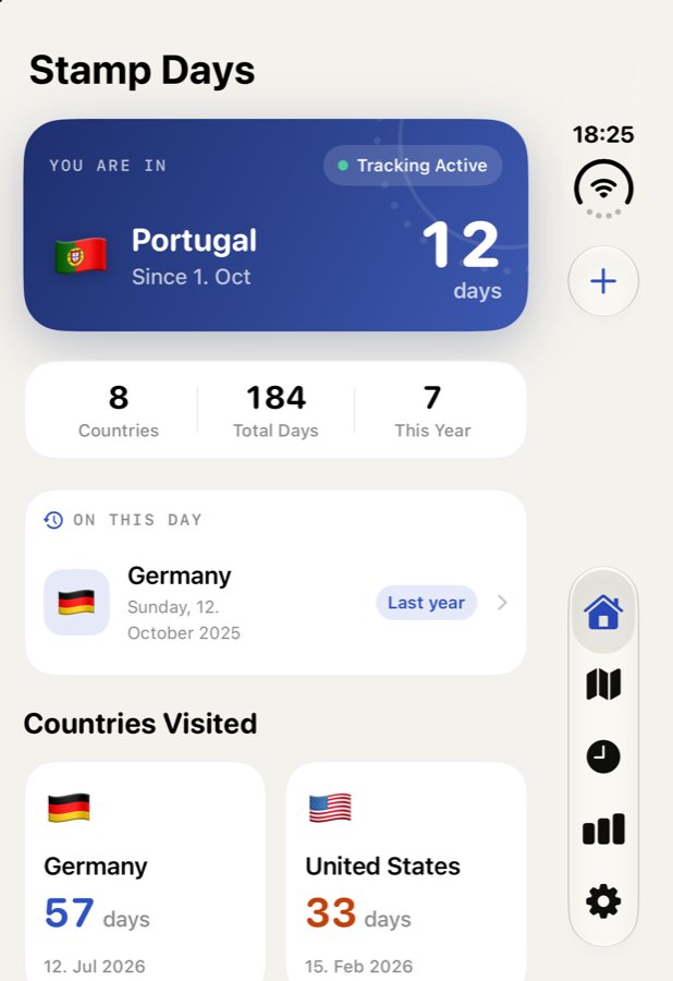
On the outer display, iOS 27.1 moves the tab bar and the toolbar buttons into a column on the side, next to the status bar. The app didn't need a single change for that. The tabs, the add button and every sheet just moved.
Unfolded: stretched
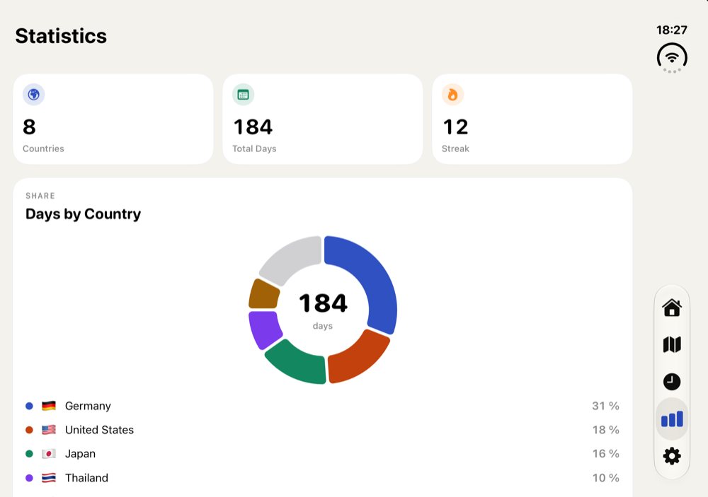
The inner display was a different story. Nothing was broken, but every screen was the phone layout pulled wide. The country cards on the dashboard were twice as wide as they needed to be, and the statistics page had a lonely donut chart in the middle of a huge white card. Apple calls this out by name: don't just stretch your iPhone app across the wide display.
The fix: follow the size class
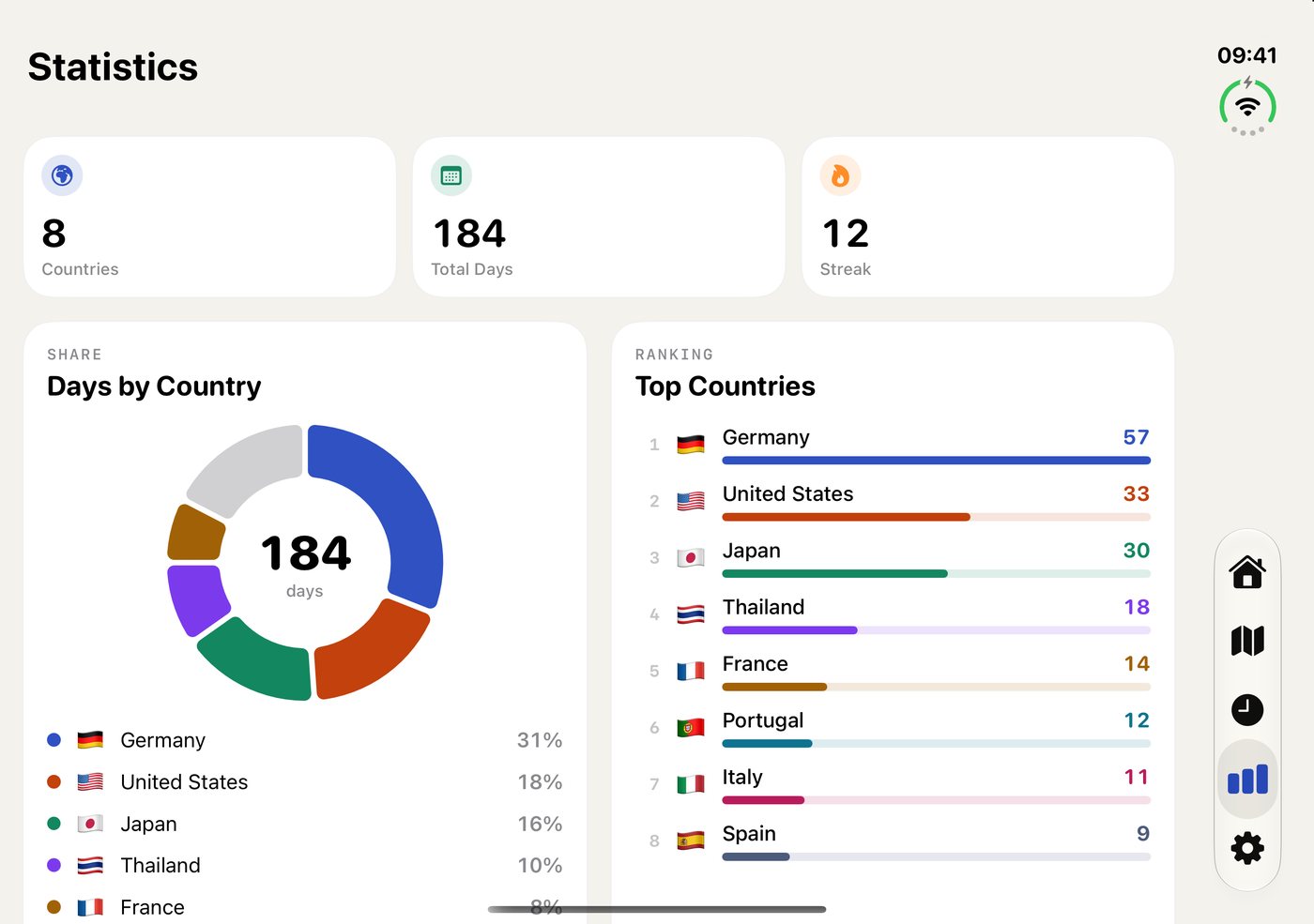
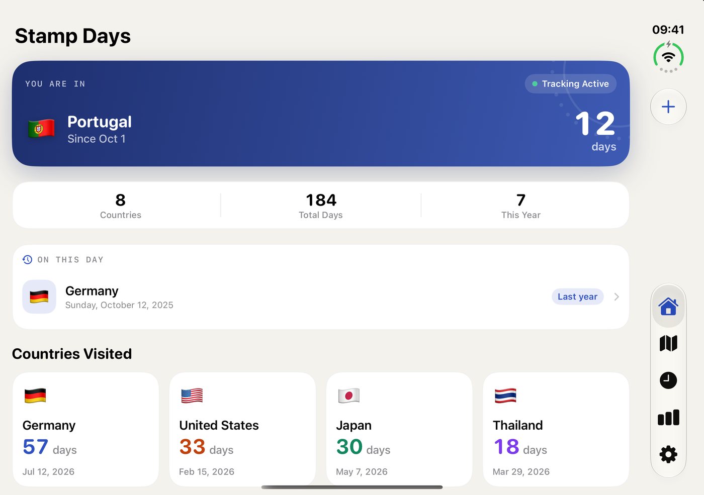
Apple's design guidance says to plan for two layouts only: compact width (the outer display, every iPhone in portrait) and regular width (the inner display). Not one layout per pose, and not breakpoints in points. So that's what Stamp Days does now.
- Dashboard: the country cards were a fixed two-column grid. At regular width they now use an adaptive grid, so as many cards fit as there's room for (four on the Duo in landscape), and each card keeps its shape.
- Statistics: "Days by Country" and "Top Countries" sit side by side at regular width, and stack as before on a phone.
The side-by-side part is a tiny SwiftUI view. It reads the size class and picks a horizontal or vertical layout:
struct AdaptiveColumns<Content: View>: View {
    @Environment(\.horizontalSizeClass) private var sizeClass
    var spacing: CGFloat = 16
    @ViewBuilder let content: Content

    var body: some View {
        let layout = sizeClass == .regular
            ? AnyLayout(HStackLayout(alignment: .top, spacing: spacing))
            : AnyLayout(VStackLayout(spacing: spacing))
        layout { content }
            .fixedSize(horizontal: false, vertical: true)
    }
}
Two details make it work well on a device that folds:
AnyLayoutkeeps the views alive. Switching between anHStackand aVStackwith anifwould rebuild the charts every time you fold or unfold.AnyLayoutonly changes how the same views are arranged, so their state survives, and SwiftUI can animate the change.- The cards end level.
fixedSizeon the container plus amaxHeight: .infinityframe on each card makes two cards side by side share the height of the taller one.
What I left alone matters too. History and Settings are scrolling lists, and Apple's guidance says scrolling content can stay as it is. Sheets, alerts and menus are positioned by the system, including moving out of the fold when the device is half open. Using the system components means that comes for free.
Testing without the device
Xcode 27.1 adds an iPhone Duo simulator, and it runs on a new iOS 27.1 simulator runtime that only hosts the Duo. A few things I learned along the way:
- The simulator has two screens. Screenshots from the command line need
--displayto pick the inner or outer one. - Folding and unfolding is done by hand in Xcode's Device Hub. There's no command for it, so I unfolded it once and let the scripts do the rest.
- I checked every tab both ways, then ran the same build on a small iPhone and a big one. In portrait they look exactly like before, which was the point.
Build with Xcode 27.1
I nearly built the release with Xcode 27.0, thinking the 27.1 release candidate couldn't go to the App Store. It can: App Store Connect has accepted Xcode 27.1 RC builds since October 5. And it matters, because the SDK decides how your app looks on the Duo. Built with iOS 27.0, the app adapts but keeps clear of the status bar on the inner display. Built with iOS 27.1, it goes edge to edge and gets the vertical tab bar and toolbars. Stamp Days 1.6 is built with 27.1.
Screenshots for iPhone Duo
App Store Connect now has an iPhone Duo screenshot slot. It's optional until April 2027, but it's the first thing people see on the new device, so I made a set right away. It uses the same design and wording as the iPhone screenshots, in all five languages, captured on the unfolded inner display in landscape. That's where the new layouts are, and the folded screen looks like any iPhone anyway.
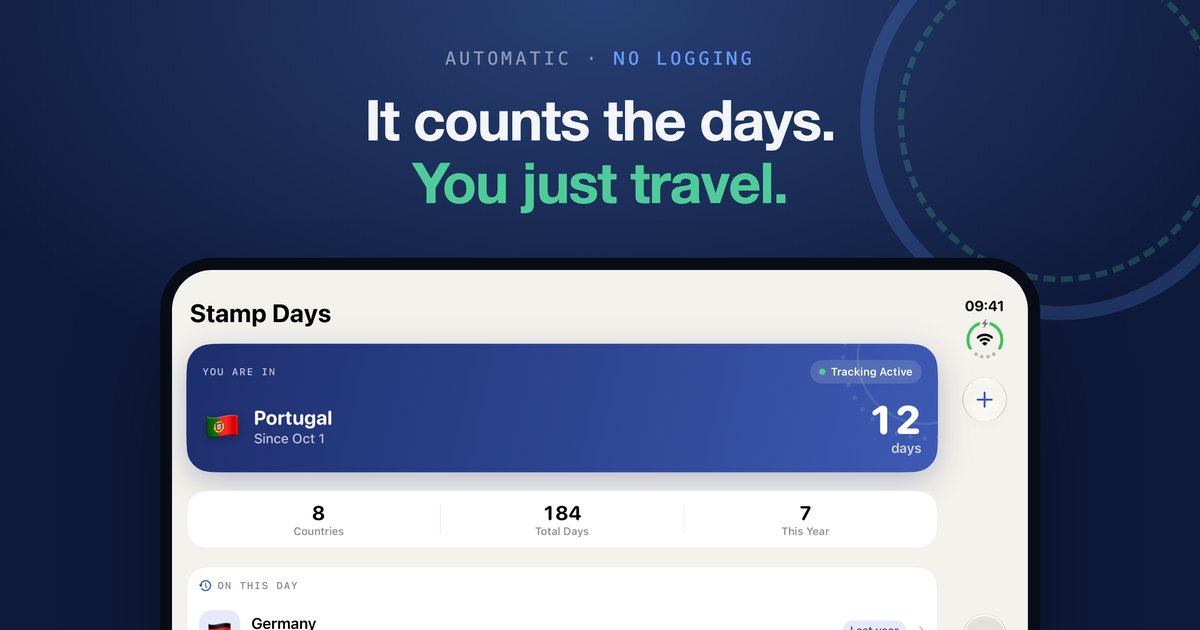
One practical note: the command-line tool I use for App Store Connect didn't know the new screenshot type yet. The App Store Connect API does (it's called APP_IPHONE_DUO), so the screenshots went up through the API directly.
What I took away
- If your app already uses size classes and modern lifecycle APIs, the Duo is mostly a layout polish job, not a rewrite.
- Design for two widths, compact and regular, not for each pose of the device.
- Let the system handle bars, sheets and the fold. Only change what looks stretched.
- Build with the newest SDK. It decides how far your app reaches on the new screen.
- Add the new screenshots early. A new device is a good moment to be seen.
Stamp Days 1.6 is on the App Store. It's free to download, needs no account, and your travel history stays on your iPhone, folded or not.
Getting your own app ready for iPhone Duo? I'd love to hear how it's going. Send me an email.