Redesigning the Stamp Days website: one wrong turn, then the passport
The app got a new look, so its website needed one too. A bold idea that turned out to be misleading, a return to the app's own stamps, and the small fixes that made it feel finished.
Stamp Days is my iPhone app that counts the days you spend in each country. It notices when you cross a border, in the background, and keeps an exact tally. You never have to open it to log anything. You just open it when you want the answer.
Version 1.5 went live on the App Store on October 8 with a full redesign and a clearer name, Stamp Days: Country Tracker. The app looked new. Its website didn't. So the day after, I sat down to redesign the site, with Claude Code as my pair programmer and the Impeccable design skill guiding the direction.
Where it started
The old site wasn't bad. Navy background, gold headline, a phone on the right. But it could have been the website for almost any app, and gold has nothing to do with Stamp Days. The app is passport blue, paper and green ink.
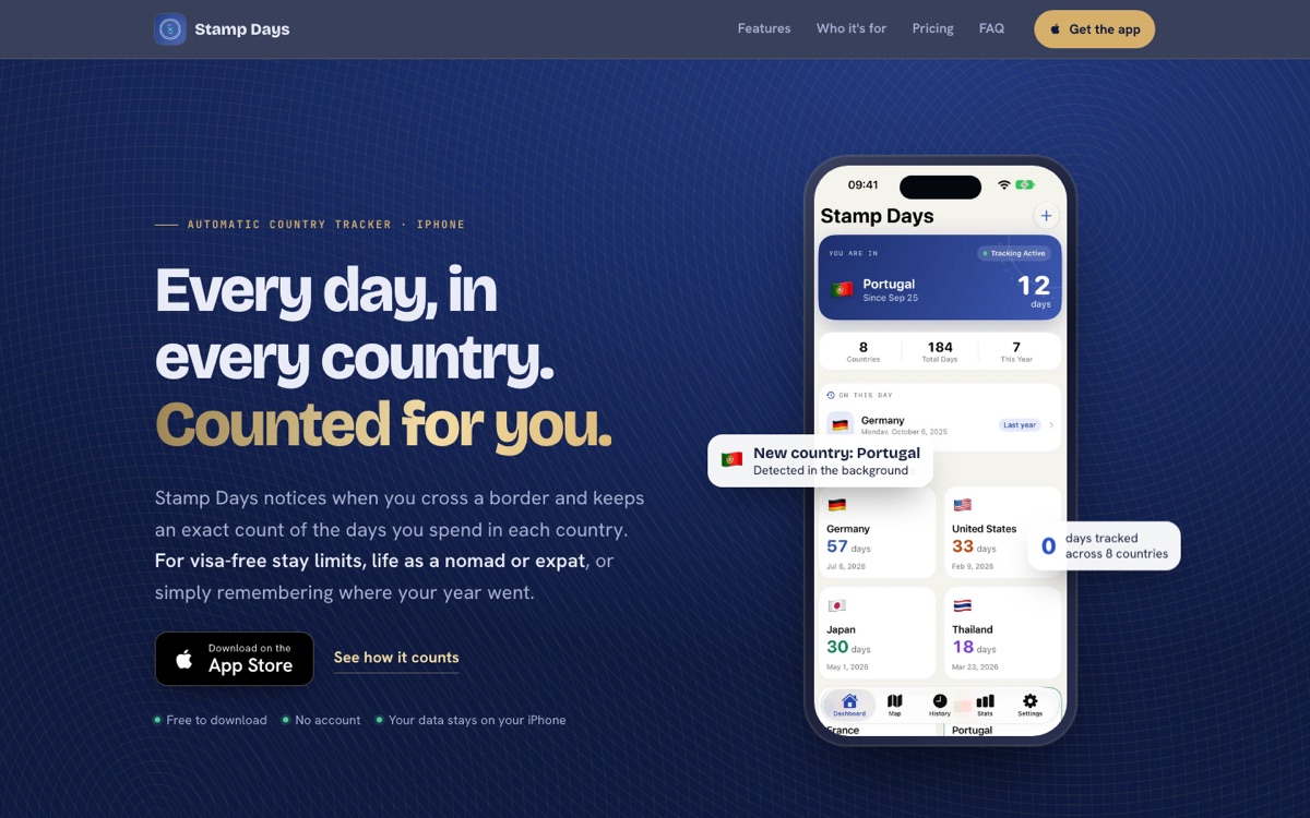
It also had a line in the intro about visa-free stay limits. Stamp Days counts days, and people do use that count for all sorts of things, but the app doesn't do visa calculations. I don't want the website to promise more than the app does, so that line had to go no matter what the new design looked like.
The wrong turn: an airport
Impeccable doesn't let you settle for the first safe look. It asks who the page is for, then picks a strong visual direction so you don't end up with the same design every AI-built site has. Mine came out as airport wayfinding: graphite walls, signal-yellow signs, numbered gates with arrows, and a big departures-board sign at the top that read "You are in Portugal, Day 12".
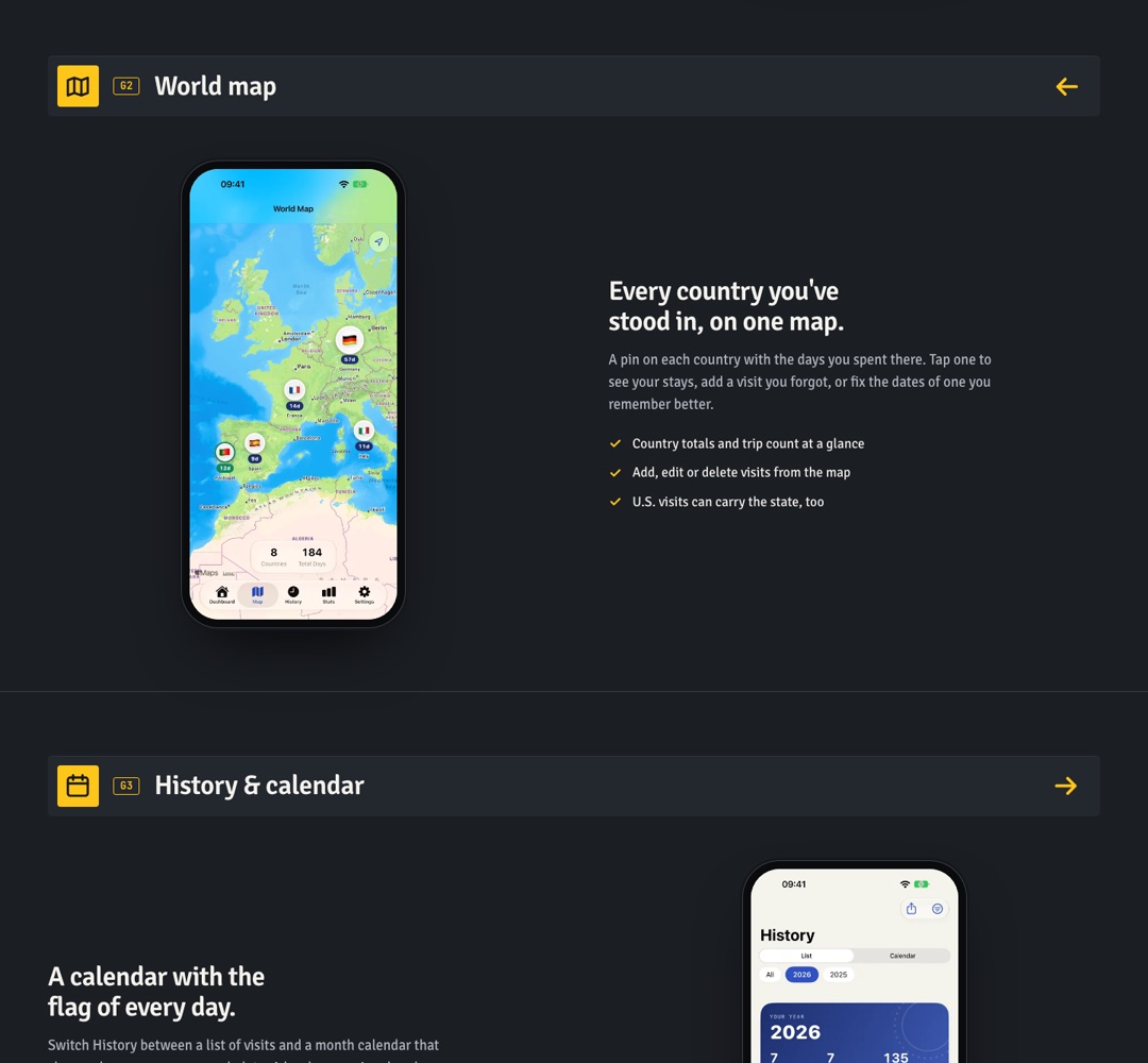
I liked it at first. It was confident and nothing like other app sites. But when I looked at it with fresh eyes, the top of the page was a problem. A sign saying "You are in Portugal" on a website reads as if the site knows where you are. It doesn't. That's the app's screen, showing example data. For a privacy-focused app that keeps your location on your phone, a homepage that seems to track you is the worst possible first impression.
So we kept a couple of airport details for later in the page and threw the rest out.
The fix: open the app's own passport
The better idea was right there in the app all along. Stamp Days is built around a passport: every country you visit gets its own stamp in its own ink colour. So the new site uses exactly that.
- The app's colours. Passport navy, paper, and the green from the app icon, instead of gold.
- The app's real stamps. The perforated country stamps from the app, drawn as vector graphics, press onto the page around the phone, each with its country code and day count.
- A passport page. One section looks like an actual passport page that fills itself in as you scroll, complete with the machine-readable lines at the bottom.
- Real screenshots from version 1.5, so what you see on the site is what you get after you download.
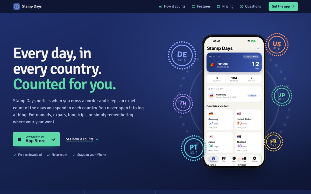
The headline stayed the same, because it was already right: "Every day, in every country. Counted for you." Everything around it changed.
The small stuff that makes it feel finished
Once the direction was right, the remaining work was details. You'd only notice them if they were wrong.
- The page jumped on refresh. Reload halfway down, and the page would glide off to another section by itself. Smooth scrolling was turned on from the very first moment, so the browser's "restore where you were" turned into an animation. Now smooth scrolling only switches on once the page has loaded.
- The type sizes felt off. I said the ratios felt wrong, and they were: the headings didn't follow a consistent scale. We reset them to a clear set of sizes so each level is visibly a step down from the one above.
- The passport broke phones. The machine-readable lines of the passport page are one long unbreakable string, and they were quietly pushing the page wider than a phone screen. One line of CSS fixed it.
- An honest "what it can't do". The site still says plainly that crossings are inferred from your phone's movement, so a very short trip can be missed or logged late, and that every visit can be edited. That section stayed on purpose.
What I took away
- A bold direction is great, but read the page as a stranger would. "Striking" and "misleading" can be the same thing.
- The best visual idea for an app's website is often already in the app.
- A website should promise exactly what the app does, nothing more.
- When something "feels off", it usually is. Measure it.
You can see the new site at heymousa.com/stampdays. And if you travel a lot, or just want to know where your year went, Stamp Days is on the App Store. It's free to download, needs no account, and your travel history stays on your iPhone.
I'd love to hear what you think of the redesign. Send me an email.